There was a time when art was created solely for expression rather than for commerce or promotion. Artists of different mediums collaborated as a mutual sign of respect for the other’s work and with the understanding that their offerings can be complementary. Of course, the days where art and finance are completely separate is an era we will likely never see again but this doesn’t prohibit modern day artists from operating under a similar ethos. One of the most prevalent examples of this is the continued association of music and imagery. Musician Ghassan Abdelnour’s “Bad Habits Keep Us Warm” is a creative collection of songs that rejects standard sounds in preference to influences like T Bone Burnett or Peter Gabriel. Engineeredby Adam Mosely (credits include U2, Beck, The White Stripes), the originality of Ghassan’s music necessitated a visual presentation that was similarly innovative. Having been a fan of his previous work for music artists, Abdelnour approached Italian Photographer and Graphic Designer Giacomo Girardi to create the packaging for the album. Whether it’s Springsteen’s “Born in the USA” or Nirvana’s “Nevermind”, the perfect image can have a profound effect on the public’s perception of the music and create a relationship that is forever bonded.

Giacomo’s process for this project was a course which many professionals avoid these days in that he took the time to get to know the artist and his music in a deep and introspective manner. It was his contention that what he created for Ghassan, from the photography to the illustrations and typography, should be infused with the meaning of the music. After listening numerous times to the album, Girardi undertook a number of conversations with Ghassan about what the music meant to him on a personal level. Giacomo communicates, “I cannot overstate how important it is to be respectful to another artist. This is why I refused to even begin working on designs until I had the entire album and the tracks were in the order that Ghassan intended. Once I had all the tracks, the lyrics and the title, I spent several days listening to them while reading the lyrics simultaneously. With Ghassan, we discussed a lot about the meaning of the title ‘Bad Habits keep us warm’ and about the fact that each of the nine tracks on the album were linked together in a sort of connected story. It was clear to me that Ghassan’s narrative as a songwriter was equally important as his melodies as a musician. In this capacity, Ghassan is a storyteller and the overall album concept was a long story which tends to always repeat itself. This observation was the first important input in my design. Regarding the meaning of the album’s title, I remember evening long discussions with Ghassan, over the phone and in person, about the concept of this repetition of painful and hurtful actions in human behavior.”

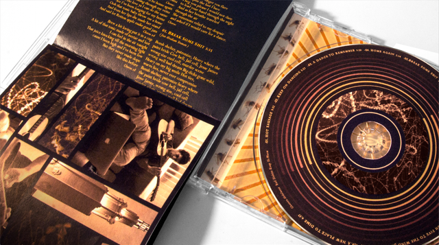
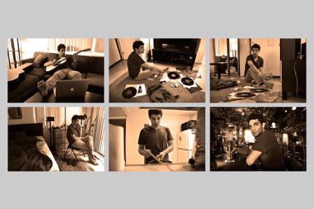
While Abdelnour supplied the sonic personality, it was Giacomo’s mission to bring its character into a visual concept. Ranging from the design of the album’s packaging to print materials like posters and the photography for the commercial and marketing campaigns, Girardi manifested a visual component infused with the uncompromising and direct music of “Bad Habits Keep Us Warm.” Create a synergy is challenging considering the album is rooted in songs rather than adhering to any one specific genre. Possessing traits of of blues, folk, country, and rock and roll, Abdelnour often prefers creating his own sounds from scratch and augmented these with effects rather than established musical instruments. Inspired by the song-centric style of the album, Giacomo created a double-gate fold layout where the lyrics are placed in a long vertical sequence. He informs, “The design idea was to use the visual of flies swarming around a light which eventually hurts them as a metaphor for humans and painful temptations. The final version of the album cover was an inverted picture of a street light with flies swarming around it. The picture was intentionally inverted to give a really abstract double meaning that in some ways refers to the female sex organ. This artwork was not only working great conceptually but also visually considering the strong blues/folk roots presence in Ghassan’s music. For the same reason, the natural color palette choice was oriented from a spectrum of dark browns transitioning togradations of light yellows. If the foldout booklet is placed horizontally, the lyrics abstractly reflect music frequencies, and in some way visually match the flies artwork around the rest of the album. For the two frontal gate pages of the booklet, I decided to combine the same flies artworks patterns with some pictures of Ghassan.” A digital booklet of this artwork is also available.

In a world full of capably talented professionals, it’s always the most passionate and committed ones who achieve greatness. The strongest advocate and proponent for artists has always been other artists who recognize talent. Giacomo Girardi professes that working with a unique artist such as Ghassan Abdelnour is as exciting, perhaps even more so, than the massive revenue generating brands which populate his professional resume. Girardi declares, “The nature of this kind of project is the actual reward. These projects are the classical examples where a designer can have pleasure during the realization of them. For my personal taste, there is nothing more challenging and exciting than working on music or literature projects for two reasons: the first reason is transforming something not visual into something visual is extremely challenging, and the second reason is the fact that these non-visual projects are art pieces themselves which makes them the most exciting clients possible.”
Writer: Angela Cooper


Be the first to comment on "Giacomo Girardi’s Anolog Artistic Approach to the Auditory Adventures of “Bad Habits Keep Us Warm”"