E-mail
marketing is one of the best-known communication channels online. Contrary to
popular opinion, e-mail marketing means not only newsletters, but rather has so
much more to offer. It was very popular before the social media era.
Nowadays it can still be useful, you just need to create compelling content and
spend time wisely. It can still be more effective at getting new customers than
social media. How can you do it?
You may have already abandoned e-mail marketing software for social media management tools and social media marketing services, but it still has its power. A Radicati Group study shows that the world sends about 196 billion e-mails daily. Do you know that over 20% of people check their e-mail more than five times per day? Doesn’t that convince you that e-mail is an effective communication channel? It should. The average person spends 4 hours per week on opening, reading and responding to e-mails.
That is why you should take e-mail marketing seriously. Most people regard it as SPAM, but that is a huge mistake. When it is used thoughtfully it may be a helpful tool to support your customer service. If you ever wondered why sales e-mails are still found to be effective in terms of sales, here are some numbers: for every $1 spent on e-mail marketing, there is a $44 return. Impressive, isn’t it? Now let’s take a closer look at some good examples of email templates worth following.

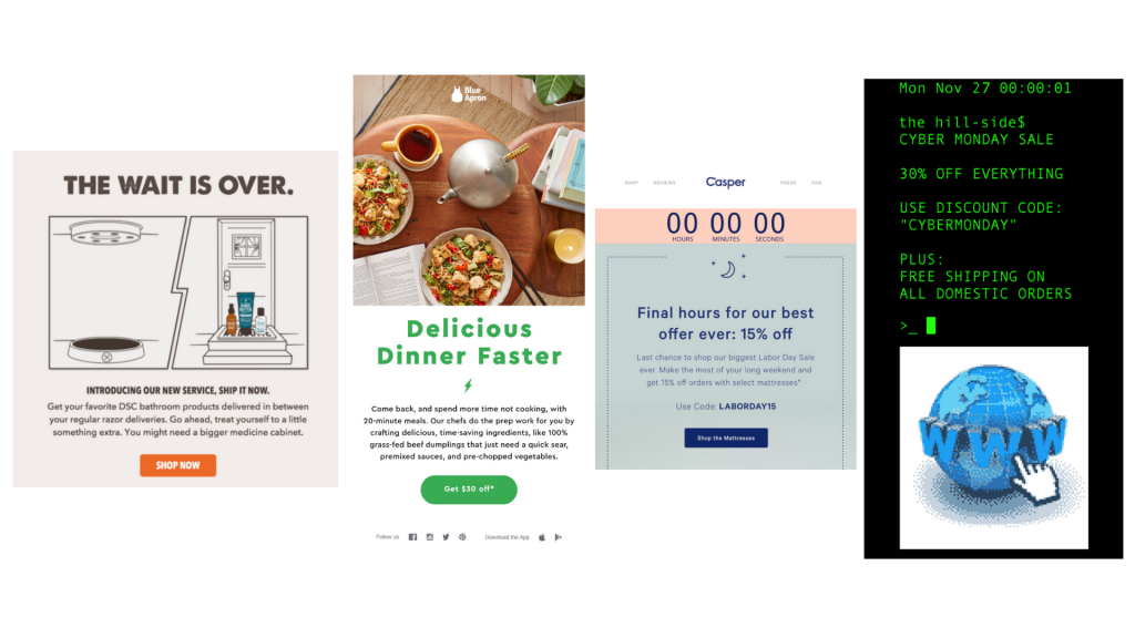
1. The wait is over.
What makes it special? First of all, it has a simple and compelling title, ending with a meaningful dot. You can find out all the information you need straight from your e-mail.
What’s more, you can shop directly from your e-mail inbox. It is also pleasing to the eyes thanks to subdued colours and easy to understand graphics.
It also proves the point that your sales e-mails do not have to be very comprehensive, sometimes a short piece of information will be enough.
2. Delicious dinner on the way
It doesn’t hurt to send some appetizing images of food in your sales e-mail, huh?
Altogether with a captivating description and clear call to action “dinner FASTER” + a significant discount, it can make any recipient pretty hungry. Therefore, they may be willing to order some food. And, additionally, they can do it directly from the e-mail, grabbing their discount for Blue Apron services for 20-minute meals.
Green colour is associated with new beginnings, so using it in your communication can help you build trust and therefore get new clients on board
3. Have a good sleep
Since this e-mail communicates discounts for sleep products – mattresses – its colours are rather delicate, not intensive. It includes a countdown counter that can make your recipients feel FOMO (fear of missing out) when the time elapses. With a clear message – BEST offer ever – and an easy to use discount code provided directly in the e-mail, purchasing is just a step away.
4. Cyber Monday
This e-mail looks like the visualization of the word “cyber”. It looks kind of old-school and relates to the very beginning of computing, or coding, but also digitalism. It is obvious that it is related to Cyber Monday! This e-mail includes all the information you need in a few simple sentences. Short stories are often the best ones

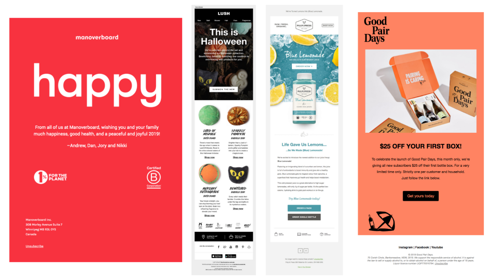
5. Happy
It is not a typical sales e-mail but, perhaps to your surprise, it can increase Man overboard sales. It shows care about clients and helps to build a bond with them in the form of simple wishes. You can take it as a quick reminder of the brand and its values.
6. Trick or Lush
Occasion? Check. Call to action (to view a Halloween collection)? Check. Quick info about products? Check. All maintained according to brand transparency? Check.
7. Are you thirsty?
This Blue Lemonade e-mail has a very consistent layout. It can make your audience feel… thirsty and willing to try that new lemonade. A quick and appealing description can make one more willing to invest your time and money in discovering this product. Plus, you have a choice about how you can order it.
8. Cheers!
The message is clear: you get 25% off your first box. It draws attention, and a potential customer can get familiar with the rest of the e-mail if they are already interested. This e-mail also highlights the rules, so there is no way you can get confused. The word “Just” added to the last sentence emphasizes the ease of use.
Sales e-mails are still in the game, you just need to know how to create them to meet the current reality. Inspired by the examples above, make your own e-mails and the ROI may surprise you in a positive way!


Be the first to comment on "Killer Sales Email Templates – Best Examples From Brands All Over The World"