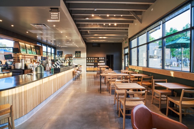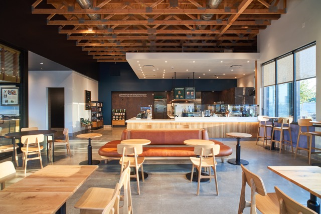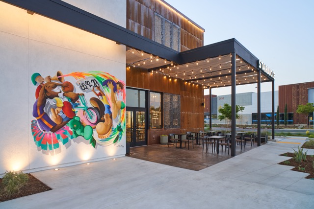
There are many reasons that Starbucks is such a successful company but its true genius is that they’ve created a place where people want to spend time in an inviting atmosphere. Key to this is the aesthetics and use of space which this company has carefully crafted. Photographer Yuya Parker has worked with the Starbucks design team for the past two years to help them communicate the approach to some of their most beautiful locations in Southern California. Locations like the Watts Community Store which features a large mural by artist Mike Norice on the outside of the building, testify to the company’s efforts to impact communities in SoCal in a manner that pleases the eyes as well as the taste buds. Yuya’s photos of these various locations are used internally (though some have also been featured in the press) to relate how Starbucks continually strives to “up their game” when it comes to a great space. If creating the ideal tone for their locations is essential to the prominence of Starbucks within the marketplace, then Parker’s photos are a touchstone for the company maintaining this high level.

A photo, even ones used in the corporate world, transmits an idea in a way which simply is not possible with the written or spoken word. These particular photos for Starbucks need to speak about function but must also impart a sense of how it feels to be within these very walls. Also having worked with companies like Airbnb, Yuya has a finely attuned eye for architecture. He reveals, “I studied architecture for a short period of time in Japan. I believe the passion I have for architecture comes across in my photos. It might be because my technical decisions and styling choices are informed by the features of the spaces that inspire me, and therefore I tend to highlight those features. Every design is unique and I tend to channel the excitement I feel for that uniqueness into my work, and I think it connects with the passion and inspiration of the designers’ work when they see the photos.”

Don’t make the assumption that achieving photos like these is the application of some template that simply displays lines and angles. It’s as much an exploration of creativity as any famed wildlife photo in that it requires distilling the visual components into a mood that the viewer can tap into. There can be a fine line between tasteful imperfection and messiness. Too perfect and it can look clinical. When listening to Mr. Parker describe his work, it’s almost as if he perceives his creations as having their own life. He communicates, “When I choose a camera angle and perspective, I am making sure that the image doesn’t look cluttered or crowded. The elements in the photo need room to breathe in order to create a relaxing feeling. The angle needs to be realistic and show perspectives that a customer in the space might have when they visit the store. I use as much natural light as possible because it adds life to the buildings and introduces a natural element. When I’m framing photos, I think about how customers would experience each store; where they walk, what they look at, how they use the space, etc. If I can get viewers to imagine what it would be like to be in the store and make them want to be there through my photography, then I’ve succeeded in my job.” Yuya Parker concedes that his work with some of the most recognizable brands (Starbucks, Smirnoff, Airbnb, etc.) makes him an extremely successful photographer in the world of advertising but he stipulates that this doesn’t alter his approach as an artist. He relates, “I have a fine art series called ‘Food as Contemporary Art’ that is conceptually tied to my memories of watching my grandmother create ikebana arrangements back in Japan. With my fine art photography, I tend to have a different emotional relationship to the work than with commercial shoots but it’s all a chance to explore emotion of one kind or another and that’s what drew me to photography.”

Writer: Arlen Gann


Be the first to comment on "Maintaining the Perfect Starbucks Vibe with Photographer Yuya Parker"